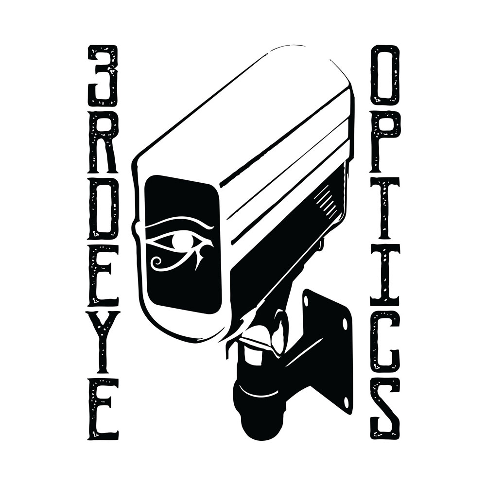
3RDEYE OPTICS is a fledgling clothing brand in Santa Barbara, CA. They shared their vision with me and from the get go we were on the same page. It’s always fun when you have similar beliefs and ideas. They actually went with 5 of my designs. Looking forward to seeing what they get up to in the future.
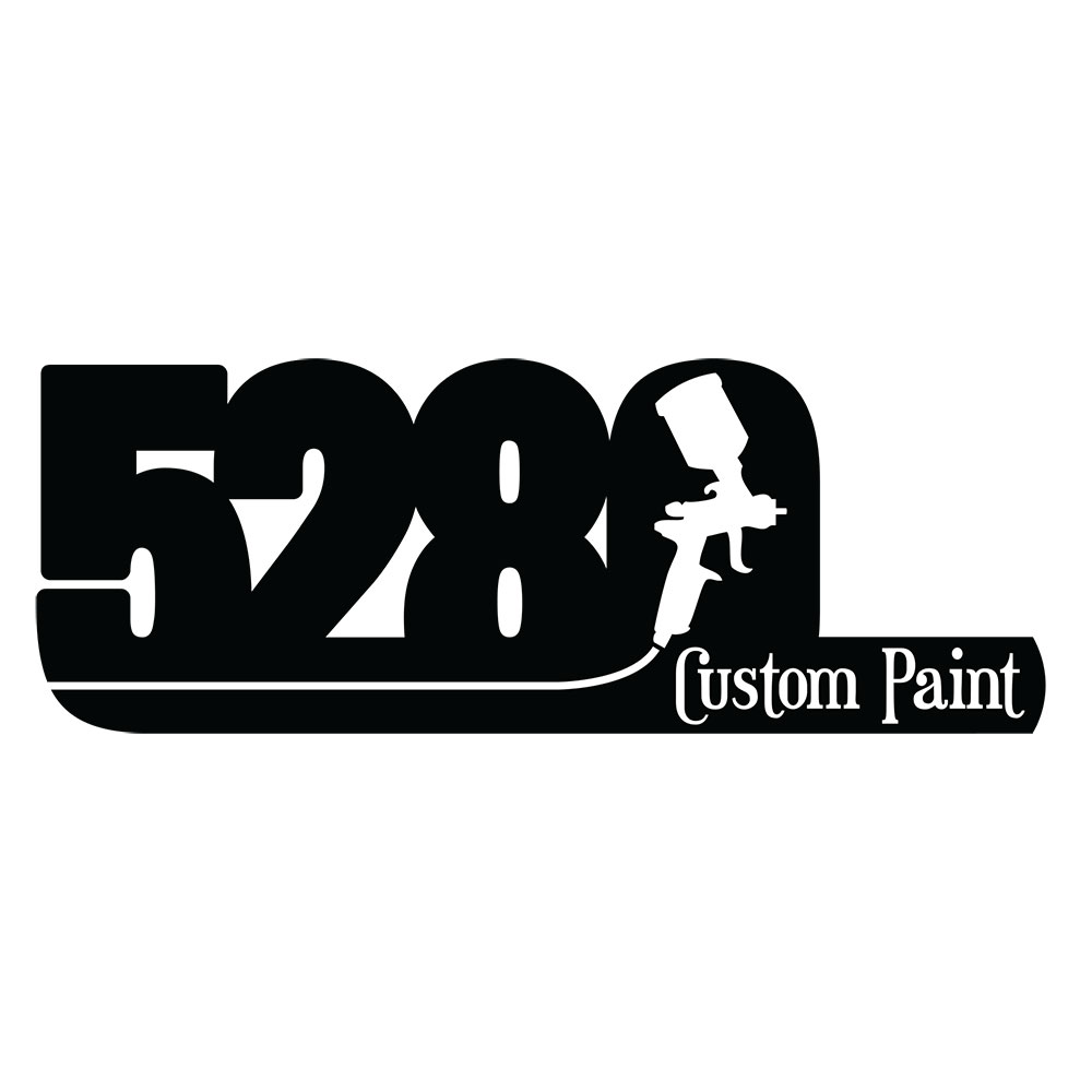
5280 Custom Paint was an automotive paint shop in Denver. 5280 is synonymous with Denver because of the “Mile High” label. I love when I can impose a graphic on top of a letter. The spray gun fit perfectly in the 0 and the hose subtly underlined the 528. A cool font for “Custom Paint” and there it is!
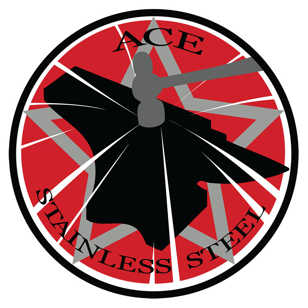
ACE Stainless Steel is based out of Denver and does custom stainless steel kitchens, concessions, cafeterias and much, much more all over the country. They liked the look of old communist propaganda art. The wanted an anvil and a hammer. I put this together and they loved it.
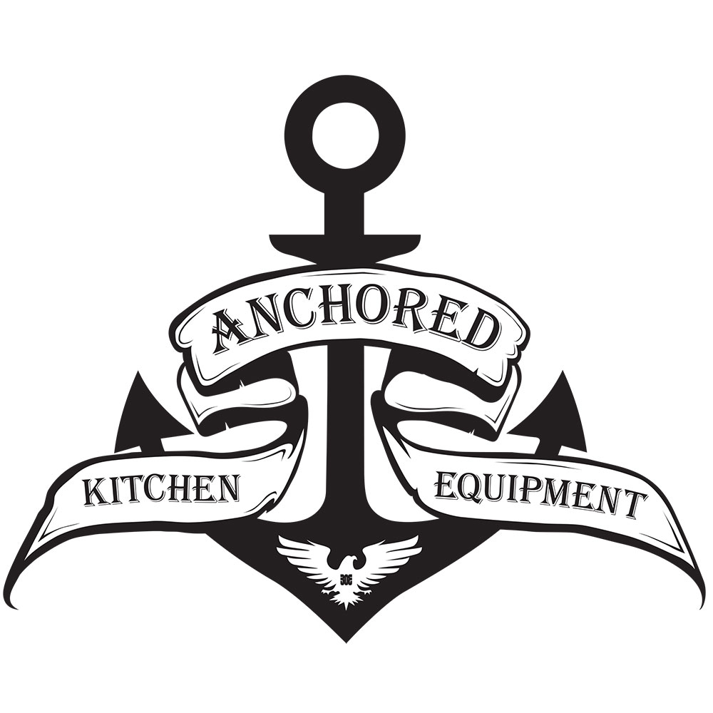
Anchored Kitchen Equipment was the follow up company to ACE Stainless Steel. Sailor graphics are just cool. A strong anchor and banner around it gave it symmetry. I put in an eagle with a 303 for the area code of Denver. It’s a subtle way to let people know they are Denver based.
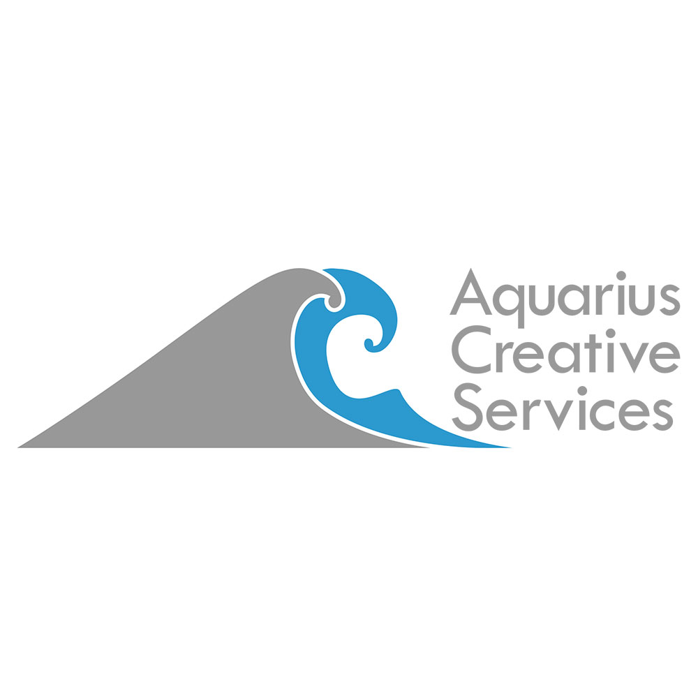
Aquarius Creative Services was a graphic design shop in Denver. She wanted the A and C to mimic waves. It was fun drawing these in Illustrator and a challenge. Making them work well together was harder then it looks. I really liked her color choices. the grey and blue look great together.
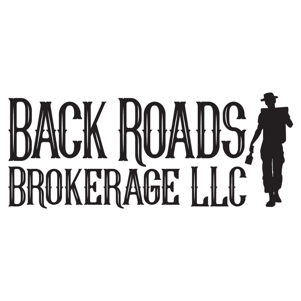
Back Roads Brokerage LLC was a brokerage company based in Denver, Colorado. Their company would go down into Mexico and find Mescal Plantations to partner with. Literal adventures! I created a guy with a backpack holding a bottle and they loved it. It really gave that feeling of exploration.
This logo for baton.fit started our completely different then the end product. As we were going through different comps I had an epiphany and put in a color bar representing a baton. My clients loved it when they saw it and understood what I was doing. That makes it all worth while.
I love the font for this logo. I was praying that my clients picked this one. Thank god they did and the fun began. They wanted to incorporate the Colorado flag in some way. I played around with it till this option materialized. The iconic state flag and my logo is a perfect fit.
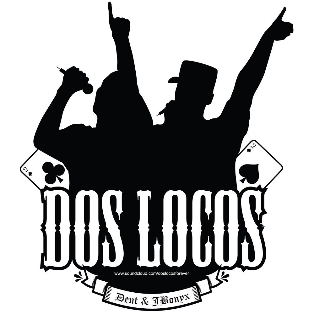
Dos Locos is a hip-hop group from Denver, Colorado. Dent asked me to include the 2 of clubs and spades along with silhouettes of them rapping. I found a cool font that I felt was suitable for the imagery and put it all together. This was my first attempt and they loved it.
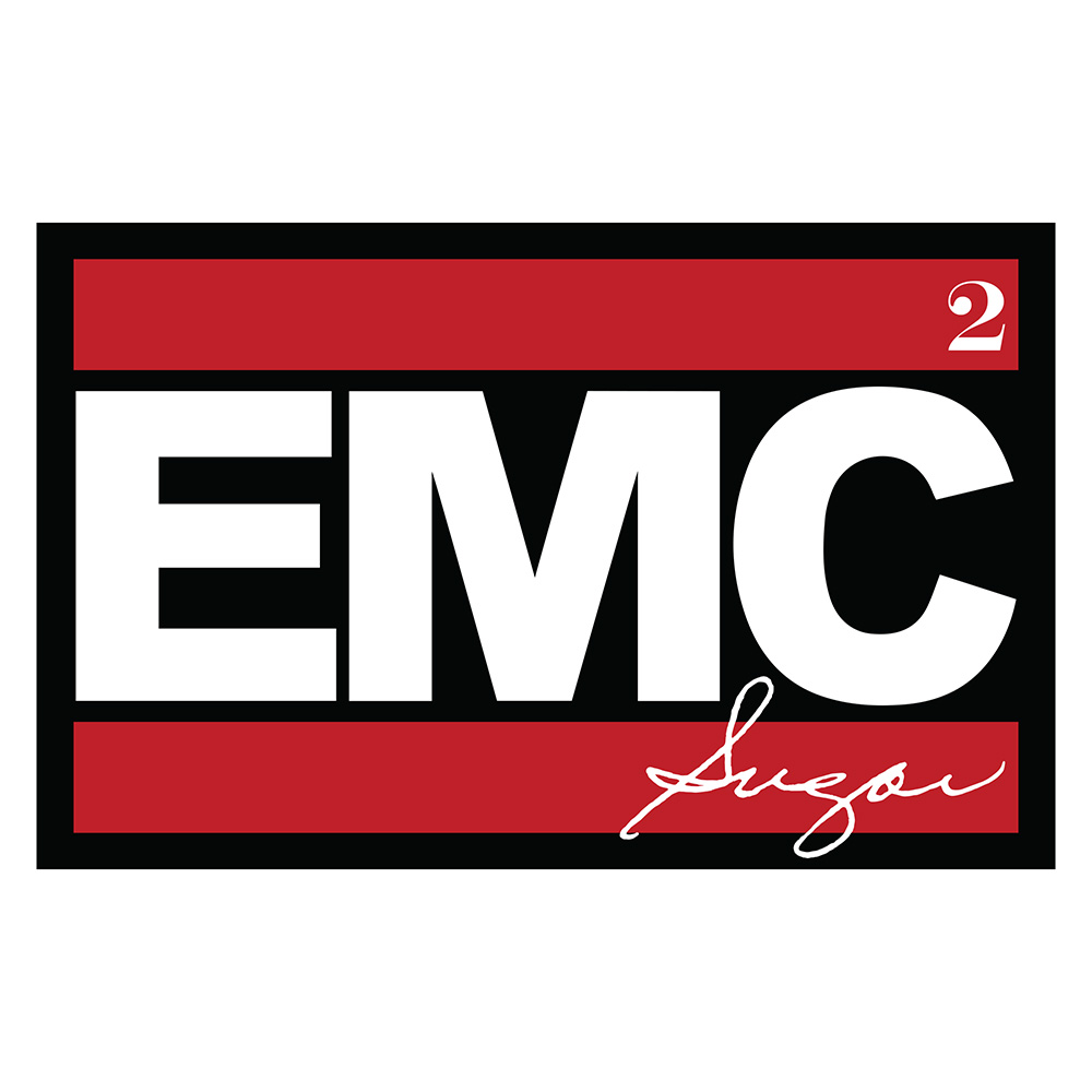
EMC Sugar is a sister owned apothecary that specializes in skin care products based in Boise, ID. She wanted their logo to mimic the logo of hip-hop group RUN DMC. I thought that was a really cool idea and was happy to create this for them.
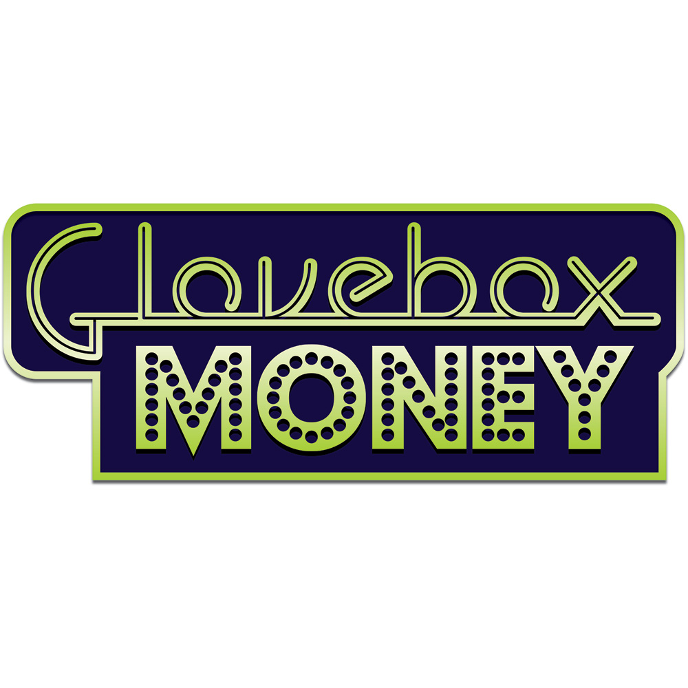
Glovebox Money was a funk band from Boulder, CO. They were around for over 10 years but recently broke up. It was fun finding these fonts and putting them together to make a cool looking esthetic. A little retro and a little gambling.
Hat Ranch Gallery is a really cool art gallery in Santa Fe, NM. This might look like a really simple logo. But, Sara is a genuine font lover. We labored over kerning, spacing and the interaction with the hat in the background. She loves how it came out.
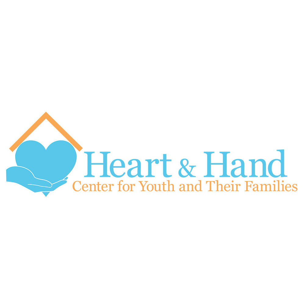
It was an honor doing this logo for Heart & Hand. They do amazing work with the kids in their community in Denver. I designed this logo in 2012 and they’ve used it ever since. That’s what you want out of a logo.
This was a fun logo for an artist in Boise. She has a really cool style of painting. She needed a logo for her social media and so I put this together. It’s always nice when another artist likes what you do for them.
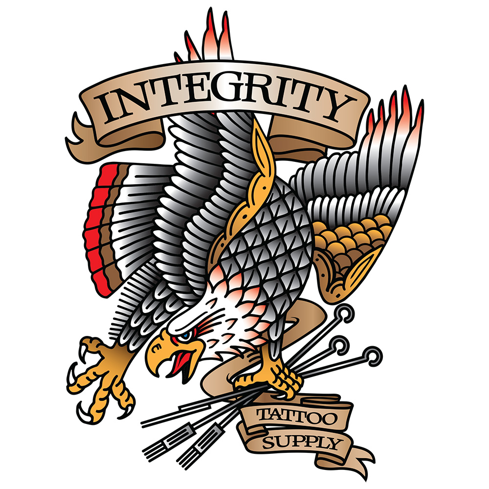
Integrity Tattoo Supply is a delivery service in the Boise area that brings tattoo shops all their supplies. He gave me the drawing of the Eagle. I combined the banner and custom font for the rest. I love the look!
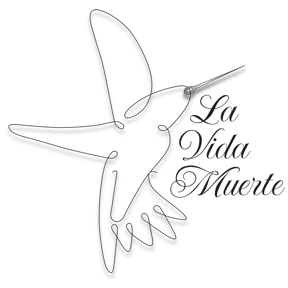
La Vida Muerte was a clothing designer in Los Angeles. He wanted me to incorporate a humming bird into the design. I even surprised myself when I thought of this way to make the needle and thread that bird.
This was another fun logo for an ice cream shop on South Broadway in Denver, Colorado. They wanted so birds incorporated into the logo. They were fun to draw in Illustrator.
Lawles by Design is a jewelry maker in Boise, ID. I doctored both of these fonts to create 2 completely custom fonts. I like the way they work together. An ornate design below to tie it together and there you go.
Marlena Design Group is an interior design group based out of Denver. Her logo was really fun because I decided to put a stone finish into the letters. That really made it feel classy.
Outlaw Ranch raises performance horses in Blackfoot, Idaho. The OUTLAW letters in the logo are from the Waylon Jennings album, The Outlaw. I found a suitable font for Ranch and the rest is history.
Restoring Balance is a CBD Oil company. This was fun putting these different elements together. The drip of oil, the leaf and soil in the background. This has a nice balance to it.
Rip Snort was a burrito truck in Boise, ID. They didn’t last long and that’s a shame. It was fun creating the fades, curvature and styling. Too bad they couldn’t stick it out because this logo was really cool.
Sarah Sawdust is a woodworker in Boise, ID. She is an amazing artist that takes a lot of time perfecting each piece. Some simple diamond shapes in the background gave it a cool look that said, woodwork.
Sugar & Ice Co. is a frozen yogurt shop in Grand Junction, CO. The little hut in this logo is the actual shop that they have on a trailer that they pull around town and sell frozen yogurt from.
TATER Networks sets up the networks for booths at conventions. I played around with the connectivity aspect by connecting the letters, except in the “o” where you can see the wireless icon in the middle.
Wild Sage Acupuncture is in Salt Lake City, UT. They wanted me to incorporate their colors into the design. A nice but subtle yin and yang can be seen with the way the sage bends in front of the mountain.
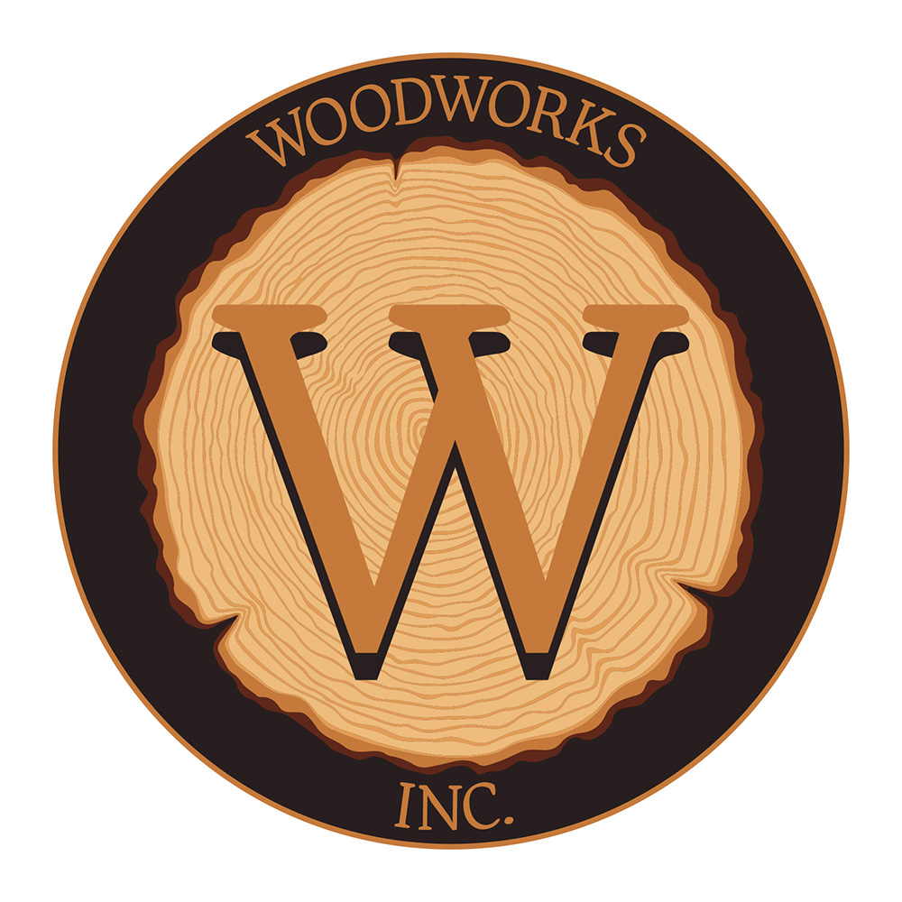
Woodworks Inc. is an outdoor apparel company in Denver, CO. They wanted a classic looking logo that could stand the test of time. I found a suitable font and put a tree in that shows the rings. They loved it!